Home / Inspiration / Room ideas
Neutral wall art ideas
Cream, stone and soft black: how to make a neutral wall feel warm and considered rather than flat.
Neutral rooms are easy to live with but easy to get wrong. Without colour to lean on, the art has to bring shape, texture and contrast. These three walls show how.
1. Use a long shelf for variety
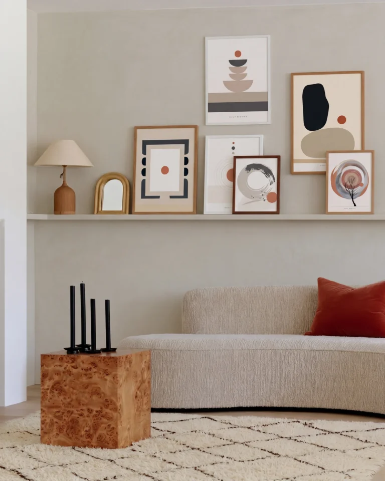
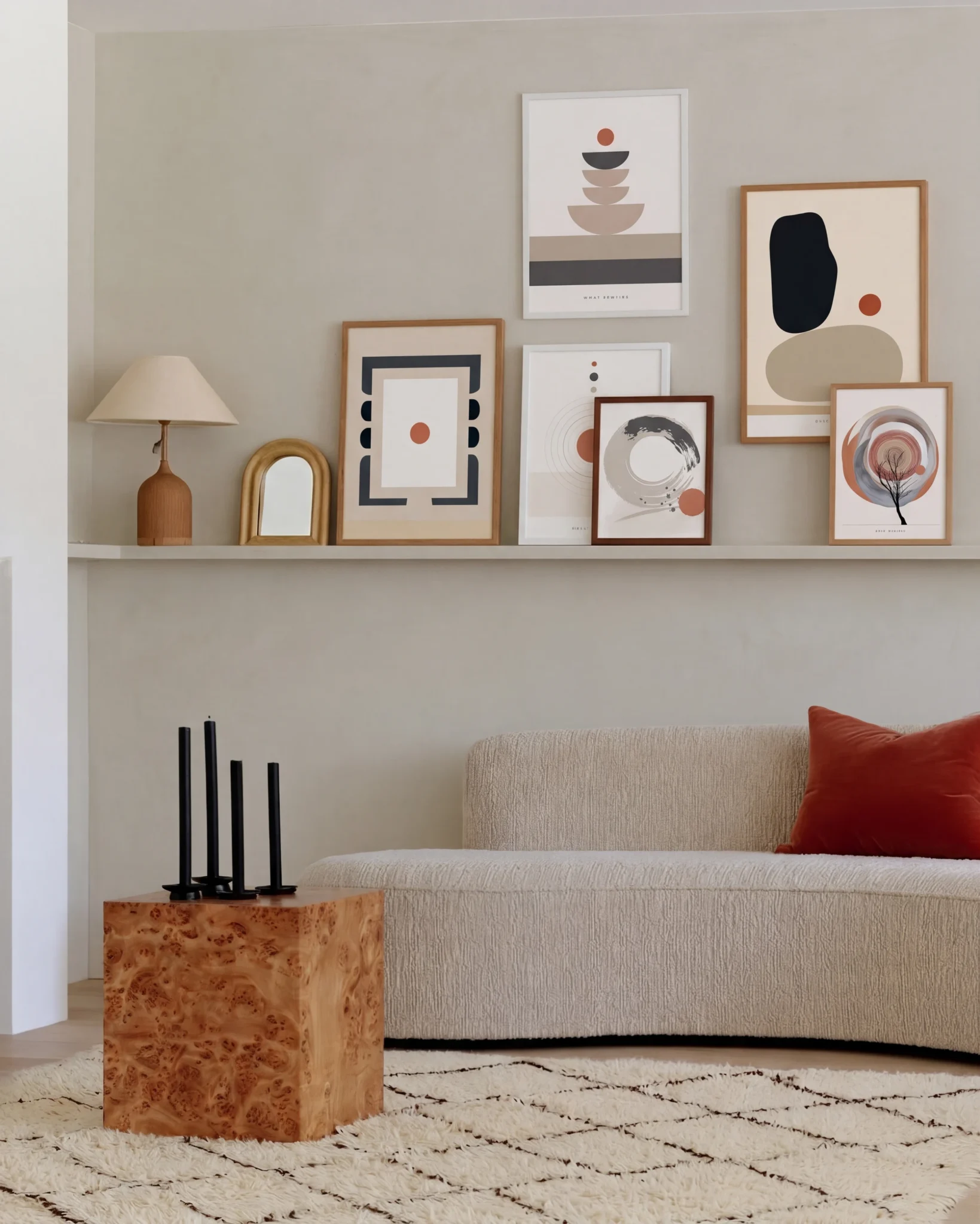
The Neutral Shelf Wall, shown at the top of this page, lines up six prints on a long shelf above a pale sofa. Frames of different sizes lean and overlap, so the wall has rhythm even though every print sits in cream, sand and black.
The Neutral Shelf Wall: six prints on one long shelf.
2. Let black do the work
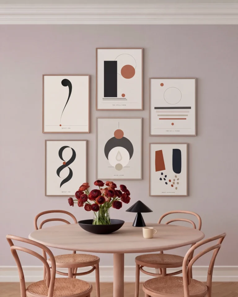
A neutral wall needs one strong tone to stop it fading away. The Quiet Shapes Wall puts six black and cream prints above a dining table. The graphic black shapes give the wall definition without adding colour.
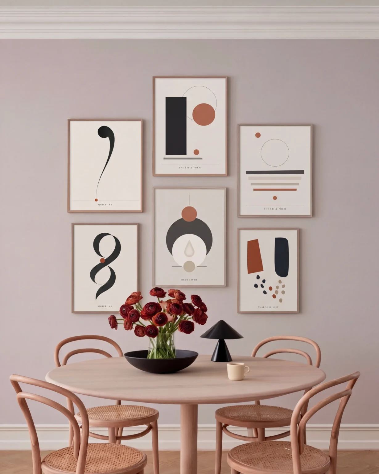
The Quiet Shapes Wall: black and cream above a dining table.
Studio tip
Mix at least three textures on a neutral wall: matte paper, oak frames and something soft nearby, such as linen or wool.
3. Keep a console calm
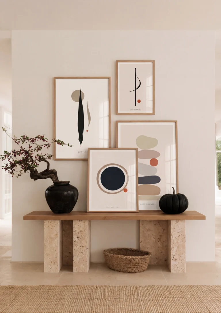
In a hallway or entrance, the Quiet Ledge groups four prints with a few objects on a console. Simple line drawings and soft shapes keep the space calm, and the objects pick up the same stone colours.
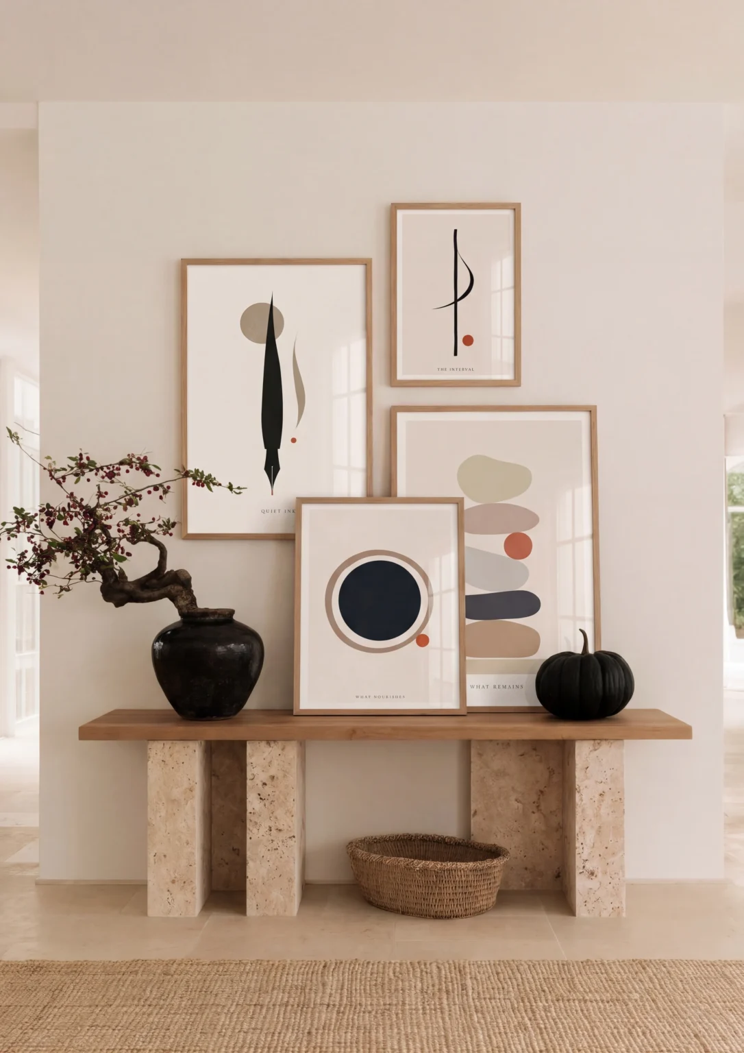
The Quiet Ledge: four prints styled on a console.
Choosing neutral prints
Look for prints with a clear shape: an arch, a circle, a single line. Pale prints with no strong shape can disappear on a cream wall. Our neutral and beige collections are a good place to start.
Try these layouts on a photo of your own wall with the Gallery Wall Builder.